The Power of Minimalist Design: Less is More
You see it everywhere: in the curated feeds of your favourite social media influencers, the sleek designs of your gadgets, the interior design ideas you saved on Pinterest, and the clean adverts from your favourite brands. Everything is always properly put together, with the underlying theme of using “less”. This simplicity you see and love is known as minimalism.
If you want to learn more about minimalism, especially in graphic design, you've come to the right place. In this article, we will explain everything related to the minimalist graphic design approach and how you can apply them effectively.
What does minimalist design entail?
Minimalism is essentially decluttering any unnecessary elements of a particular work and focusing on what is deemed necessary by the creator of the work. Minimalist designers believe that there should be a focus on a particular subject matter. To strip it down further, minimalism in graphic design is about designers expressing their views or the views of their clients using only the most important elements of a project or subject matter.
The concept of minimalism is very popular in industries such as architecture, interior design, and graphic design. Minimalist graphic design has gained immense popularity over the years, particularly in the marketing scene. This is because there is a focus on the message while employing the use of a clean aesthetic to accompany the message that is being conveyed without shifting the focus.
The concept of minimalism isn't exactly new. The history of minimalist design in art has spanned different decades and has impacted various industries. Starting from the late 1950s and early 1960s in the U.S., its roots trace back to earlier movements like De Stijl and Bauhaus, which emphasised abstraction, simplicity, and functionalism. Minimalism developed as a reaction against the emotional intensity of Abstract Expressionism. Some of the key characteristics include a reduction to essentials, geometric forms, and the use of industrial materials.
Features of a Good Minimalist Design
1. Simplicity: Simplicity is a cornerstone of minimalism. When it comes to minimalism, simplicity is a must. Minimalism is a big advocate of keeping things simple in order to focus on what is truly important. Keeping designs simple and uncluttered can be achieved by:
Limiting Elements: One of the most important aspects of minimalist designs is the use of only essential elements to convey the message being passed along. Try to avoid the use of complex designs and imagery because it will distract the audience from focusing on the message.
Use of Negative Space: Negative space, also sometimes known as empty area, is the unmarked area between and within a design’s visual elements. It is important to use negative space in your designs because it creates a sense of balance and this makes the design look more arranged and professional. It can also be used to add more depth to your design by drawing attention to certain elements of your design.
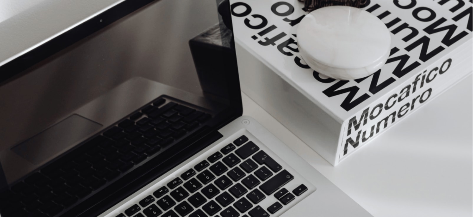
2. Use of Clean Lines and Shapes: In minimalist graphic design, the use of clean lines and shapes is perfect for achieving a simple yet impactful visual aesthetic. It focuses on reducing elements to their essential forms, often using geometric shapes, sharp lines, and a limited colour palette to convey the intended message or feeling without unnecessary clutter. This emphasises clarity, simplicity, and often a sense of elegance or sophistication in the final design.
A great example of the use of clean lines and simple shapes and elements is the Apple logo. The logo is in the shape of an apple with a clean, smooth silhouette. It features a single leaf at the top and a bite taken out of the right side.
3. Limited Color Palette: A good minimalist design limits use of colour. The design should use no more than three colours at most. This is because introducing multiple colours might distract the viewer from the purpose of the design.
Use of Monochrome Scheme: A monochrome scheme in design is the use of variations of a single colour. This approach will create a harmonious and balanced design colour scheme.
Use of Accent Colors: Accent colours are used to emphasise the colour scheme to add a bit more to the design. Let's just say it's a colour that is introduced to qualify the existing colour scheme.
4. Functionality: One of the key features of minimalism is functionality. When designers design with functionality in mind, there is a focus on ensuring that the design is not just aesthetically pleasing but also easy to use and navigate. Every design element introduced has a clear purpose or use, whether it's to inform, guide, or facilitate interaction. This user-centred approach ensures that the design meets the needs of its audience effectively.
5. Simple Typography Set: There is a great importance placed on the typography or typeface used in all graphic design work and this is also relevant in the minimalist design aspect. If you have noticed, most of the fonts being used in minimalist designs are simple fonts, nothing too over the top. Prioritise the use of readable fonts and also limit your use of typefaces to two and make sure they complement each other.
6. Visual Hierarchy: When it comes to minimalist design the main purpose or function is to get the viewer to focus on the subject matter and a great way to do this is by using visual hierarchy to guide the viewers. Visual hierarchy is the arrangement of elements in a design in a way that directs the viewer’s eye through the content in a direct order of importance. The idea of this is to use visual elements to show viewers which is the most important aspect of the design and guide them using the visual cues.
To sum it all up, the very essence of minimalist style is stripping away the unnecessary aspects of design to mainly focus on one thing, most times it's the message that is being passed along.
If you believe your brand will benefit from minimalism, Brand Mavins is the perfect design agency for you. Book a call with us today and let's discuss how to make your brand stand out with timeless designs.